
coca-cola
sip + scan
Concept Idea: A daring resurrection to the iconic brand that is Coca-Cola
Client Timeframe
Coca-Cola 2 weeks
Role
UX designer/researcher
Responsibilities Members
Research Lauri
Ideation Julia
Synthesis Bill
Prototype Patrick
Wireframes
Personas
Usability Testing
Information Architecture
The company
Coca-Cola is a multinational company that prides themselves on bringing about happiness, optimism, and innovation through their products and marketing strategies.
The problem
Coca-Cola is a household name everyone loves, yet their rewards program, Sip + Scan, is heavily flawed and lacking the joyfulness that represents the iconic brand. They need a way to renovate the app so their customers feel valued in their loyalty to the company.
Process

The Project
Coca-Cola created a rewards app that loyal customers loved. They had great perks and users felt rewarded for their loyalty to the brand. In 2010 they revamped the app and it was downhill from there. Coca Cola's intention with Sip + Scan was to provide their customers with fun and exciting experiences, yet the app did not work. Scanning a coke product was near impossible, and users found themselves using the app and never winning. They wanted the old app back, and this is where we came in to help.
Goals
The goal of this project was to create an app that customers loved to use again, and more importantly, an app that would allow them to feel valued for their loyalty to such a giant corporation. Users wanted to feel like they were contributing to what makes Coca-Cola great, and also winning some cool prizes along the way!
Coca-Cola’s Simple 4-Step Process

Coca-Cola advertises their app as easy to use with these simple steps. Unfortunately, using the app was not this simple.
As can be seen from the picture above, Coca-Cola laid out a four-step process for using Sip + Scan. Users would open the app or website, click “Scan Now”, snap a picture of the lid, and receive a prize. Unfortunately, this four-step process was much more convoluted than the picture depicts.
Given this simple step-by-step process, we knew users were getting caught up somewhere. In order to better understand their frustrations, we decided to perform a heuristic analysis and download the app for ourselves to see where their pain points came from. It did not take long before we began to understand why users gave it such poor reviews. All of us came to the conclusion that we would have deleted the app after the first five minutes were spent trying to figure out how to scan a bottle of Coke.

Limitations
Sip + Scan only had one way for customers to scan their products: the icon often found on the inside of the lid. They did not offer QR codes, barcodes, or product codes. This gave users a lot of frustration because many times the code was partially rubbed off or just simply would not focus because of the film on the lid.

Why Continue To Use A Faulty App?
We knew users were having trouble, yet they still continued to use the app and remain loyal to Coca-Cola. The first step in recreating a better app was to understand our users more. Why were they using Sip + Scan? What were their end goals? Where did their frustrations begin?
Finding The Answers To Our Questions
In order to answer the questions we had regarding the app and our users, we did a plethora of research…
Part 1: Interviews
Throughout the heuristic analysis, we made a list of critical issues and rated the severity of each problem we encountered. From there we were able to gain key insights and formulate an online Google survey and perform a contextual inquiry with questions tailored to our findings from the heuristic analysis.
We wanted to know…
How often were people drinking soft drinks?
What was important to them in a rewards/rebate program?
If they had participated in rewards programs in the past, what did they like and dislike?
What rewards did they expect from a rewards program?
Part 2: User Reviews
We continued our research by reading user reviews. We wanted to know what people were saying about their experience. The quotes below are from our user interviews, as well as Reddit and Google reviews of the app. It was very obvious that customers were extremely disappointed with Sip + Scan. Coca-Cola has an incredible marketing team and are a beloved brand, but it seemed they were having quite a bit of trouble in the app department. Coca-Cola made this transition because they felt people valued experiences over rewards, but from our research it is clear that rewards are still at the forefront when it comes to what users want out of rewards/rebate apps.

Putting It All Together
We began to sift through the information from our Google survey and heuristic interview to narrow down our key insights even further…
Affinity Map

We created an affinity map that gave us six very prominent insights:
Sip + Scan needed a better UX design.
Sip + Scan needed an easier scanning method.
People want Coca-Cola merchandise.
The old rewards app was working very well and customers miss it.
Sip + Scan takes too long to use.
Customers want better rewards.

Target Audience
Millennials
Young Adults (25-35)
Lower-income brackets
College students
Once we had our insights narrowed down, we decided to focus on the target audience for Sip + Scan.
Our intended audience was based on a competitive analysis of other rewards/rebates apps that have high reputations. We looked at Domino’s Pizza, Dunkin’ Donuts, Pepsi, Starbucks, Subway, My Panera, Ibotta, and Acorns. Through our research, Ibotta, Starbucks, and Dunkin’ Donuts all had the highest customer satisfaction. The common denominator in all three apps were their amazing rewards/prizes; something Sip + Scan was sorely lacking. Each company rewarded you for buying one of their products or buying from one of the brands they associated with.

Google Survey
Our survey received 62 responses. 56.5% of those responses preferred discounts and coupons as rewards. 54.8% wanted reward points they could eventually redeem. This helped confirm our heuristic analysis, which only further confirmed our insights from the heuristic interviews. Some type of tangible reward was important in rewards/rebates apps.
personas: Power user + novice
Once we had the bulk of our research finished, we felt comfortable creating our personas and journey map.
Through the synthesis of our research, we realized we had very two specific types of users: beginner and advanced. We created Cole, the power user and Rebecca, the novice user. Cole loved Coca-Cola and wanted to be rewarded for his loyalty. He wanted to feel that he had a relationship with the company he loved and supported. Rebecca wanted to be rewarded for her shopping habits. She wanted to be able to earn cash-back for shopping and the ability to give back to the community while shopping.
While both Cole and Rebecca had differing goals and pain points, they did have one major commonality: they wanted to receive a reward or prize for their loyalty to a brand. They wanted to feel valued and appreciated for their contribution to a brand, however small.
Once our personas were created, we were able to generate a journey map and use the key insights we gained from research and synthesis to walk us through the emotions a user experienced while using Sip + Scan. This greatly helped confirm our user flows and pain points. We focused on the high points of the journey map and tried to eliminate as much of the low points as possible while going through the ideation process and creating our lo-fi sketches.

Taking pen to paper
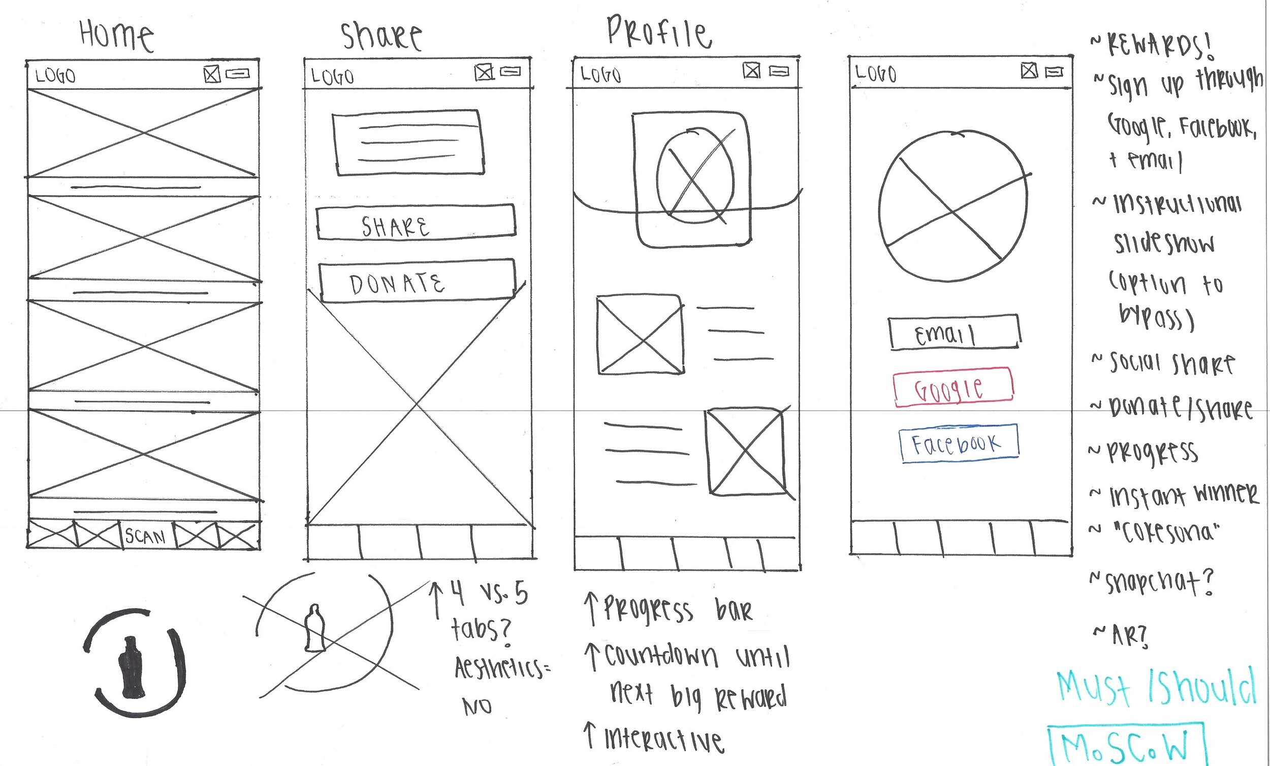
Once our personas were complete we began sketching and figuring out the layout of our app. We used the MOSCOW method to help us narrow down what we really needed in the app to satisfy users.
MoSCoW Method
Despite Coca-Cola having a very large following and a strong and loyal fanbase, this app was still part of their brand and customers were making it very known they were unhappy. Earning and keeping a customers trust is the most important thing, and we did everything we could to ensure our app would leave customers satisfied, happy, and returning.
We knew we needed to focus heavily on the pain points the users were mentioning and address each concern appropriately. We took to the whiteboard, and through the MoSCoW Method we were able to figure out what our app absolutely must have to address our users concerns, what we should have and could have if time alloted, and what we would not include.
Should + Could:
Instant winner.
Milestone rewards/achievements.
Ability to connect to Facebook and Instagram.
“CokeSona” to create your own bitmoji and customize it.
Snapchat integration.
Must:
Ability to sign up/sign in through email, Facebook, and Google.
Onboarding.
Donate/Share.
Rewards: birthday, discounts, merchandise, gift cards.
Progress of points and rewards earned.
Design Studio and Wireframes
We each did rounds of design studio to figure out what we wanted the layout of our app to look like. We each came up with about 8 different layouts for the homepage, which gave us 32 ideas to choose between. We all had very different visions of what the layout should look like and what we wanted each page to cover. Before diving into Sketch, we decided we needed to finalize our content more.

We took to the whiteboard
to get a more thorough flow. We worked through what we wanted out of each page and then decided to break up the wireframing and have each person draft 1-2 pages in Sketch. Once we reconvened, we handed our Sketch files over to Julia, who worked extremely hard to give our files consistency. Before we finalized our hi-fi wireframes, we put them into InVision so we could begin early usability testing.
Early Stages: Lo-Fi Wireframes

Early lo-fi sketches as we played around with layouts and what we wanted the navigation bar to look like.

Lo-Fi Homepage + Rewards Page
I worked specifically on the homepage and the rewards page. I played around with drop shadows and trying to give the app a bit more of a 3D feel. I also wanted to keep the rewards page simple and easy to navigate.

Mid-Fi Homepage + Rewards Page
I brought the home and rewards page up to a higher fidelity and played around with the navbar and what to include on the homepage. I wanted call-to-action buttons for users to be able to click on right away. I also played with the idea of having a hamburger and what that would look like once the user clicked on it.

Mid-Fi Homepage
I was tasked with creating the homepage, and I wanted to keep the great images Coca-Cola is famous for. I wanted the homepage to be very sleek and clean, yet inviting for the users.

Sign up Flow
I was also tasked with creating the sign in/up flow. Again, I wanted to keep to the Coca-Cola brand, pictures, and colors. I played around with different ways to utilize the bold colors so that it was not too harsh on the eyes.
So, What Did Our Users Think?
We began user testing fairly early on in the process because we were struggling with finalizing our wireframes and knew we needed to get feedback before proceeding.
We had specific tasks for Cole and Rebecca, which we gave each user.
Rebecca’s Tasks:
1. Create an account with Facebook.
2. Scan a coke and redeem it for yourself.
3. Sign out.
Cole’s Tasks:
1. Sign in.
2. Donate to Jeengle using the “Share a Coke” feature.
3. Check your account for donation history/current balance.
4. Look at six-pack in rewards/favorites to see if you have enough points.
5. Sign out.
User Feedback

Overall, we received great feedback from the people who tested our app. One main point of confusion we ran into was having people donate. They did not know how to get to the actual page. It was under the “Share” category, which many people thought was for social media. We simply changed the icon to a handshake, which helped immensely.
The process of user testing was, of course, extremely helpful in finalizing our prototype, and it was very insightful to see the little things people would take notice of and get confused about or really enjoy.
out with the old in with the new

fixing the scanning issue
With the old scanner you could not use a QR code or a bar code. This made scanning frustratingly impossible for users. We chose to implement a QR code, barcode, as well as the ability to scan the receipt if you threw away the bottle before remembering to scan it. We also included instructions on where to find each code, which the old version did not have.

Homepage revamp
We brought life to the homepage by allowing users to interact with it. The old homepage did not have much for users to do. Our users wanted to feel involved and like a member of the Coca-Cola family. We added promotions, happy hour, and fun tabs for users to explore.

giving sip + Scan personality
The old version did not have much users could do aside from scanning. We added a rewards page with the option for users to create a “Favorites” section, as well as the ability to filter rewards based on the category or number of points. We implemented donating to a charity and sharing a coke with a friend, which was extremely important to users. We also brought life to the “Profile” page. On the old app it was just account details. We wanted users to be able to see their progress and be able to feel that they were contributing to the Coca-Cola brand.

Navigation bar
The old nav bar was very tiny and difficult to see. We decided to make the icons bigger and easier to see. We also wanted users to always know where they were in the app, so we made the tab the users were in red. We also made the scanning feature front and center since that was the big call-to-action Coca-Cola wanted users to focus on.

Color Palette
We stuck with the original Coca-Cola red and brought in a few neutral colors to balance out the pop of color with the red. We felt this kept true to the brand, but was calming and easy on the eyes.
reflection
This concept project was a very humbling and rewarding experience. It was my first time working on a team, and I learned a lot about how to navigate that process. Redesigning an app is an amazing and complex process that requires incredible attention to detail and very thorough research. It requires thinking outside of the box and having a deep understanding of your users goals and pain points. Creating this new version of Sip + Scan showed me that research and design are two processes that are never truly “finished”, but you reach a point where all the user goals are met and the app starts to come alive and resemble an amazing user-centric product that exceeds all expectations.