
Dental lifeline network’s dentacheques
A sweet revival to a life changing nonprofit

Rona, a sweet, 72-year-old woman from Florida was diagnosed with stage 4 non-Hodgkin's lymphoma. She received intense chemotherapy treatments that resulted in nausea, hair loss, and extreme fatigue. She also developed an unusual side effect called xerostomia, which decreases saliva production and causes your teeth to fall out.
On top of the helplessness she felt from her cancer diagnosis, she now had to figure out how to take care of dental issues that she was unable to afford, and she was denied public aide and turned away from multiple agencies she reached out to for help.
Rona was referred to Donated Dental Services, and it was through their program that she finally found a ray of hope in a series of unfortunate circumstances. Three very selfless DDS volunteers all worked with Rona to extract 25 teeth, place 8 implants, and fit her with a full set of implant dentures.
I am so pleased to report, that not only is Rona in love with her new smile, but she is also in remission and currently cancer free.
Unfortunately, Rona is not the only one who is denied public aide and is unable to afford the dental care they desperately need. Medicare does not cover dental care, and Medicaid covers little to no treatment for adults. This puts many at odds who are already dealing with trying times.
Fortunately, there are incredible nonprofit organizations that work insanely hard to help as many people as they can. Dental Lifeline Network is one of the amazing organizations, and this is the story of how we helped bring compassion back to their website.
Client Timeframe
Dental Lifeline Network 3 weeks
Role
UX/UI designer
Responsibilities Members
Research Lauri
Ideation Chris
Synthesis David
Prototype Matt
Wireframes
Personas
Usability Testing
Information Architecture
THE COMPANY
Dental Lifeline Network is an amazing nonprofit organization that works to provide treatment to the most vulnerable people with disabilities or who are elderly or medically fragile. Through their program, Donated Dental Services, they are able to provide free, comprehensive dental treatment to those who cannot afford treatment, or cannot get public aide.
THE PROBLEM
Dental Lifeline is a nonprofit and they are funded, in part, through a program called DentaCheques (100% of the proceeds go towards Donated Dental Services). DentaCheques is a coupon book that went from a physical, printed version to a digital version in 2017. This transition caused a lot of confusion and frustration amongst those using the coupon book, and as a result, Dental Lifeline took a big financial hit. They needed a way to bring more life and empathy to their website and bring more awareness to what their mission is.
Process

THE PROJECT
Dental Lifeline Network created a coupon book called DentaCheques. This coupon book was originally a physical, printed version. They offer four different packages from three primary dealers (and one no-dealer option) that most dentists get their equipment from. A dentist office chooses a package, and for $169 per year they have access to over 150 coupons. Through this coupon book, dentists can save up to $14,000 each year, and it goes to the amazing cause of supporting Donated Dental Services and helping those who need it most, just like Rona.
Donated Dental Services is a program that has over 15,000 volunteer dentists and they work with 3,500 labs across the US. Since the start in 1985, Donated Dental Services has helped over 120,000 people and provided nearly $380 million in donated dental care.
GOALS
The goal Dental Lifeline Network wanted to achieve was to create a website that showed the heart of their mission and the lives they are changing through DentaCheques and Donated Dental Services. They wanted to inspire empathy and compassion in others to donate and volunteer to help those who need it most. DLN wanted to bring more awareness to their programs and less confusion. They wanted people to understand that they were associated with both DentaCheques and Donated Dental Services because often times people did not put the two together. Mainly, DLN wanted to help the underserved and those who were unable to help themselves, and they wanted a website that reflected that.
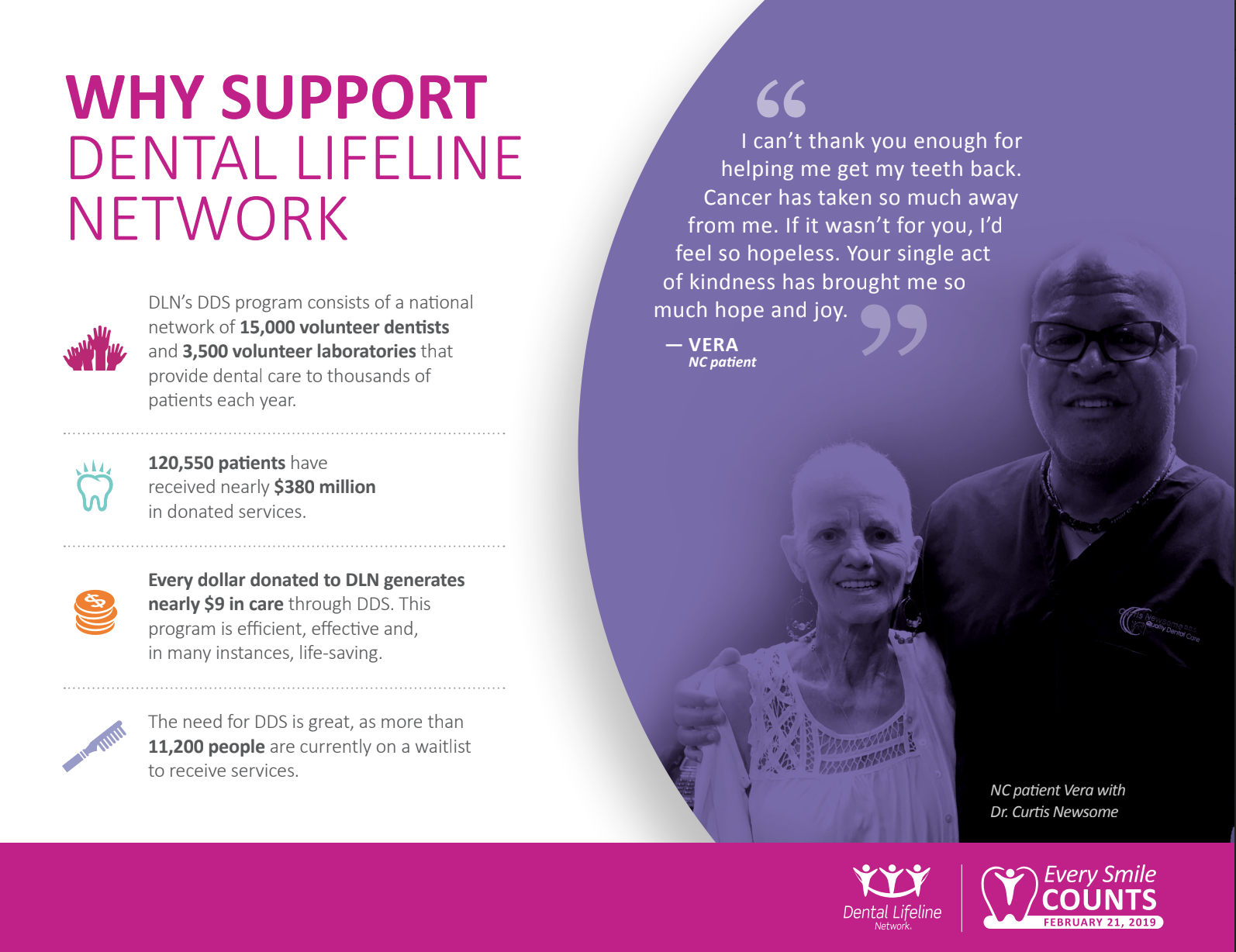
This is an image from DLN’s branding material they provided us with. As you can see, there is an amazing need for this service, as well as helping an incredible cause. Unfortunately, this type of empathy was nowhere to be found on their original website and there was nothing that really grabbed your attention and helped you understand why you were donating and what the cause was for.
Initial Meeting
We had an initial meeting with the VP of marketing, as well as the marketing coordinator. They supplied us with a plethora of incredibly useful research, analytics, and data to assess.
We were able to sift through many different surveys and found beneficial insights as to the pains and frustrations users experienced with DentaCheques.
Through our review of the research supplied we were able to develop a heuristic evaluation, as well as a competitive analysis. The heuristic analysis helped narrow the pain points even more, and the competitive analysis helped us focus on things to implement to DentaCheques.
From our initial interview we narrowed down the areas of focus:
Making the path to purchasing DentaCheques easy and impactful.
Display offers better.
Streamline proof of purchase process.
Garner more awareness.

Too Many Names…
Dental Lifeline Network is the main nonprofit organization, but their name has changed many times over the years. They also added programs, such as Donated Dental Services (DDS) and DentaCheques. Many people are unaware DDS and DentaCheques are even associated with Dental Lifeline, which causes great confusion and frustration for those trying to navigate their website. We needed an easy way to explain each program.

Lack of awareness
The biggest issue is that people just have no idea who Dental Lifeline Network is. They have no idea who they are associated with or what their mission is. This greatly decreases the traffic of their website because people are unable to distinguish who Dental Lifeline Network is versus Donated Dental Services and DentaCheques.

Help Just One
While Donated Dental Services is on a volunteer basis, many dentists who choose to volunteer just once become volunteers for life. The issue is generating more awareness about these programs to gain more volunteers and helpers.
Why such low engagement?
For the first week we tried to get in contact with people who had used DentaCheques before. We wanted to run early usability tests to better understand why more users were not engaging with the site. Clair, the VP of marketing, provided us with the telephone numbers of multiple dental office managers from dentists offices around Colorado who regularly used DentaCheques. We decided to reach out to them and inquire what their experience was.
Through our conversations with dental office managers, we were told five main points about DentaCheques:
No one actually knows about DentaCheques.
Need more volunteer dentists.
Labs are getting too overwhelmed.
There are still 10,000 patients waiting to be seen.
The process to redeem is incredibly difficult. The website is not intuitive.
Our big takeaways were that we needed to bring more awareness to DentaCheques, as well as make the entire process of using the website much more seamless.

Whiteboard challenge
We decided to start figuring out our layout and ways to streamline the redeem process, as well as submitting proof of purchase and make sure we are making an impact with the website.

“The Wrongest Idea”
We started a “Wrongest Idea Whiteboard Challenge” where we discussed the most crazy and outlandish ideas we could think of and then began to narrow them down to what could actually be implemented and what could work. We ended up with five solid ideas and began to narrow those down to the top three. Once we had the top three, we decided to each do our own design studio and roughly sketch lo-fi wireframes to get an idea of what we wanted our layout to look like.
hand-drawn wireframes
Once we had the main ideas that we wanted to incorporate into the website, we each came up with different hand-drawn sketches of what we wanted our layout to look like. We used websites like Ibotta, Project Worthmore, and Doctors Without Borders for inspiration.


Meeting with the AADOM Chapter president
We were granted the opportunity to speak with the local AADOM (American Association Dentist Office Managers) chapter president, who invited us to their event. We were able to meet with a couple people at the event and gained even more insight into the frustrations of Dental Lifeline Network and their DentaCheques program.
Restratigizing
After the chapter meeting we found out that many people knew of Dental Lifeline’s volunteer program, Donated Dental Services (DDS), but had no idea it was actually related to Dental Lifeline at all. Most had not heard of DentaCheques and did not understand what it was. This brought us back to our initial findings from research that awareness was a major issue DLN was facing. We decided to go back to the whiteboard to come up with more features and attributes to include to help DLN get more traction on their website.

Features + Attributes
Going from print to digital caused less people to talk about DentaCheques, thus decreasing awareness. We needed people to start talking again, so we wanted information about the yearly coupon book to be included in newsletters and emails in dental offices. Once people hear what DLN does, they are always eager to learn more. We just needed to get the information out there. We also felt that creating an impactful and empathetic website would draw more people in. DLN has an amazing mission, they just lack a way for their voice to be heard on a larger scale.
Wireframes, User Flows + Personas, OH MY!
Once we felt comfortable with our research, features, and layout, we decided to begin putting it all together. I was tasked with creating the user flows, personas, and lo-fi wireframes.

Tasks
Ordering and redeeming a package were the two major pain points for users. Redeeming a coupon was often difficult to find and uploading an invoice for proof of purchase was confusing. We wanted to make these steps extremely intuitive and straightforward. We treated it like a shopping experience and made sure the steps to completing each task were short and simple.

PHILANTHROPIc phil
Phil is a dentist at a small family practice. His main mission is to serve others, and he absolutely loves what DLN stands for. However, he wants to be able to serve more communities and bring more awareness to the cause. He does not like that patients are no longer sent directly to his office, and he wants the ability to purchase more than one package. Phil is a big fan of giving back and wants to be able to provide the best care to those that need it most.

DILigent danielle
Danielle is Phil’s dental assistant and prides herself on her diligence and ability to work in a fast-paced environment. Like Phil, Danielle loves DLN’s mission, but wishes the process was more intuitive. She needs the invoice process to be streamlined and would love a more cohesive experience. She feels the redemption process is difficult and DentaCheques is not as convenient as it was before making the transition from print to digital.
Order a Package Lo-Fi Wireframes


Redeem Lo-Fi Wireframes


The Design Process
Once we had the lo-fi wireframes finished we decided to start bringing them up to mid-fidelity.
***NOTE: Our clients did not specify high-fidelity. They were expecting mid-fidelity, which is why we did not take it to high-fidelity. We did a run-through of our final creation and our clients were more than thrilled with the results. We were able to meet with their developer, and they are planning to implement what we have done, so check back on their live website for the changes!
Style Guide

Branding + style
Dental Lifeline Network provided us with a comprehensive style guide to help in the assistance of creating their website. This was extremely helpful in terms of wording, phrases, and pictures. They are heavily focused on the people they serve and want their language to reflect that. They believe in the world they do and the way they design their website reflects their mission.

Color Palette
Dental Lifeline Network, Donated Dental Services, and DentaCheques all have the same color palette. Their focus is on the bold colors with softer pops of color throughout. We kept the same colors, but we dispersed more of the softer, warmer colors and used the pops of color for call to action buttons. We felt this was easier on the eyes.

Homepage revamp
The new homepage versus the original. We wanted the homepage to grab the users attention and give them detailed information on what DLN and DentaCheques is all about. We focused heavily on pictures and statistics to catch attention. We also had a very simple and easy process for how to buy, save, and help. The old homepage had an entire page dedicated to participating partners, which we felt was not necessary, so we changed it to scroll across the bottom of the homepage.

You Can Change lives with us
DLN’s mission is changing lives and helping the most vulnerable. We wanted that to be front and center on the homepage. Many people are unaware that Donated Dental Services and DentaCheques are all part of the same company, so we wanted to bring that to attention. Users can learn more, or they can purchase a package from DentaCheques. We felt having a big data visual was also important in grabbing the user and displaying empathy and compassion for the amazing things Dental Lifeline Network does. We are extremely proud of this homepage and feel it really makes an impact and shares the mission with pride.

More information
New and original “ordering a package” page. The original page was very plain and did not have any information regarding the packages. Once you clicked on the package you were given the same description for each package. We decided to pull out the wording and display it next to the packages. We also explained in more detail what each offer meant. This gave users more information regarding their orders.

Order a package
This is a bigger picture of ordering a package. We really wanted to showcase more information. One of the complaints was lack of information throughout the website. We wanted to provide users with specific details so they knew exactly how to purchase, what their donations went to, and how the entire process worked.

Create a new account
When purchasing a package, you could either sign in, or create a new account if you did not already have one. We did not change much with this flow. We broke up the steps to lessen the visual tension and make it easier to see what you were filling out. In the original process, the promo code was placed at the top and was very difficult to see. We moved the promo code to the bottom, which greatly helped. Many users did not see the promo code in the original version.

Already have an account?
We added this section to the flow. With the old website, you had to create an account and enter your information every single time. With this new step, users are able to login and have their information already saved after their first purchase. This saves them an extra step and time when they are in a hurry to get through the checkout process.

A Redemption to the redemption process
We cleaned up the redeem process page and gave things more space, visually. Originally, the value was underneath the “Redeem Now” button, and it was the same color, so users assumed it was also a button to click. We moved the values up to the pictures, and this greatly helped users process what they were seeing better. The original page also had filters that did not work. We created a filters using the offers, as well as being able to enter keywords that would sort through the products. This also saved users a lot of time who already had a specific product they wanted to purchase.

Proof of purchase made easy
When redeeming a coupon, users need to provide a proof of purchase that they bought the product they are trying to use the coupon for. Users encountered a lot of frustration with this section, so to make it easier for them, we decided to create a way for them to upload a PDF or image of their invoice, or they could use their webcam or the camera on their phone to take a picture of the invoice directly. This greatly decreased user frustration and was one of the main hits of our redemption to DentaCheques.

Thank you! Now what?
The old confirmation page gave no information on next steps. There was no way to begin redeeming or purchasing other packages. We added verbiage to direct users on what to do next. They could redeem right away, as well as look at featured offers from the package they purchased. We found our users thought this was a clean and simple way to direct them to the redemption process.
reflection
Working with Dental Lifeline Network was a truly gratifying and humbling experience. I know I speak for my entire team when I say we are eternally grateful to have been given the opportunity to work with such a selfless nonprofit organization that strives to do the best they can for those that need it the most. I deeply resonated with this company and the lives they are changing on a daily basis. We wanted to provide a seamless user experience and help them create an even bigger impact and reach even more people.
We were very fortunate to be able to present to not only the stakeholders, but the developer as well. She was extremely excited about what we had put together and wanted to begin implementing things immediately. Dental Lifeline is staying in contact with each of us, and we will get word on when the live website will be up and running.
This was such a valuable experience, and one that I benefited from greatly. I learned so much about working with a team, clients, and stakeholders. Communication is number one when working with others. It is so important to make sure you are constantly keeping your clients up-to-date. This is a valuable measure to the success of delivering an end-product that goes above and beyond.