Macrometer: a responsive design created in 48 hours

The Problem
Like many active and busy people, Jake is always on the go and often does not have the time to plan out his meals for the week. He is health and fitness conscious and wants to ensure he is reaching his daily macronutrients. Most nutrition apps calculate your calories and macronutrients, but none give you a breakdown of meals to eat for the day that fall within your daily range of macronutrients.
The Goal
Jake needs an app that will allow him to calculate his calories and macronutrients to reach each day, as well as the ability for the app to generate meals based off his macro goals. The app needs to provide variety and the ability to cater to different eating styles.
Client Timeframe
Jake Ursetta 2 days
Tools Role
Sketch UX Researcher/Designer
Zeplin Visual Designer
InVision
Responsibilities Members
Research Lauri
Wireframes
Usability Testing
Style Guide
Zeplin
Process

The Idea
This concept was created in less than 48 hours and was heavily focused on visual design and aesthetics. The goal was to bring a previous project from lo-fi to hi-fi. However, I was not feeling motivated by my previous projects, so I decided to work on bringing to life an idea that I previously created. What originally started out as a closet organization app ended up turning into a nutrition app.
How did I go from a closet app to a nutrition app? Well, I am still working on the closet organization app, but I am needing more than a few days to perfect that vision. I will have it updated on my portfolio as soon as I am finished working on it, so stay tuned and check back!
After realizing my closet app would require more time to create I went back to the drawing board. My family is filled with very active and busy individuals. We are always on the go and are all very health and fitness oriented. One evening my brother and I were talking about how great it would be to have an app that would not only calculate your macros, but also come up with meals for you. It would take the hard work out of planning each meal and calculating every single item to fit your macros. That often requires time that neither of us feel we have to waste. We also thought it would be great for the app to connect to your refrigerator and tell you the items you need and currently have. Over the span of a few hours we realized we had developed a very fun and creative nutrition app that had never been done before. Thus, Macrometer was born…

The Next 48 Hours…
This project timeframe was initially five days. However, I spent the first two days trying to figure out how to make my closet organization app come to life. By the time I came up with my nutrition app I had less than 48 hours to put together a responsive design and get it set up to put into Zeplin for a developer. The time crunch was pressing, but I thrive on a challenge. I knew I needed to get this finished, so I put my head down and got to work.
What Do USERS Look For In A Nutrition App?
I did not have the time to delve into major research, so I knew I needed to ask users questions that would provide me with key insights to move forward quickly. I formulated a five question interview and distributed it to people at my gym, Manic Training, and I also went to my local 24 Hour Fitness and Lifetime Fitness to talk to people coming and going from the gym.
Through my interviews I uncovered five major key insights:
A lot of people use some type of nutrition or food tracking app.
The majority of people still struggle with figuring out what meals to eat despite knowing their caloric or macro goal.
The number one goal in using a nutrition app is to lose weight, reach a fitness/sport goal, and help people stay on track and maintain their healthy lifestyle.
Many people feel nutrition apps are time-consuming to use because you have to enter in every single food item and cannot manually adjust your calories or macros.
Progress indicators are important. People want to see their achievements and goals being reached.
My number one goal in creating this app was to satisfy user goals. I wanted the app to be innovative and meet needs that other apps were failing to meet.
I did a competitive analysis on three popular nutrition apps: MyFitnessPal, MyPlate, and MyMacros+.


The three nutrition apps above all had very high reputations and users were, for the most part, satisfied with the content the apps were providing them with. I noticed these apps and many others were still lacking the ability to accurately come up with meal plans tailored to users based on their preferences. I also noticed many complaints regarding usability. These apps were still not able to allow for easy entry of food items and keep that item so the user could quickly enter it again. These were two issues I wanted to address in Macrometer.
Who Uses Nutrition Apps?

Cameron the crossfitter
Cameron competes in crossfit competitions, and as a result, he focuses heavily on nutrition and hitting his macronutrients each day. His constraints are time and food options, as he is pescatarian. He often finds difficulty in coming up with meals to prepare that allow him a variety of options for his pescatarian diet. He needs an app that will allow him to filter his food preferences and provide quick and easy meals for him to prepare. He also wants an app that will take the hard work out of creating a grocery list and figuring out what items he needs.

Active Aria
Aria is a busy mom of three. She loves working out and staying healthy to keep up with her energetic little ones. She often times herself pressed for time when it comes to meals and wants to make sure that not only are her nutrient needs being met, but her family’s as well. Aria needs an app that will give her the freedom to create delicious and healthy meals for her family.
Because I was so short on time, I quickly came up with two users and their constraints and needs within the app. This allowed me to expand my creativity and try to design an app without restrictions. I wanted users to be able to filter food options, have meals formulated based off their macros, calories, and food preferences. I wanted them to be able to tailor the app towards whether or not they were cooking meals for themselves or an entire family, while still being able to see their individual breakdown. I wanted the users to feel that this app was personable in helping them reach their goals.
Lo-Fi Hand-Drawn Sketches
I had a general layout I wanted to work with, so I quickly jumped into Sketch to bring my vision to high-fidelity.

The Design Process
I wanted to keep the visual layout clean and sharp, but I also wanted to play around a bit with the logo. I found this bowl with food and refined it. I played around with the spacing, shapes, and colors. I tailored the rest of my app around this icon.
WHY SHOULD YOU use MACROMETER?

The “why” was extremely important for this app. There are many nutrition and macro calculators out there. I wanted to hone in on what users were asking for and give them a visual breakdown of why Macrometer is different than others out there. Taking the hassle out of meal planning was of the upmost importance, and I wanted to make that clear from the second you land on the homepage. I felt that I was able to visually play with my creativity with this section. I wanted a “Learn More” button so that if users wanted more information about the app they could easily have access to that.

Nutrition PLUS…
Through my interviews and talking with others I realized people don’t want to have multiple apps for different purposes. I decided to combine fitness and nutrition by including workout plans to go along with the meal plans. I wanted this to be completely customizable and tailored to each individual. I also felt having a way for users to come together would be fun and engaging, so I wanted to incorporate cooking classes and other fun interactive things for people using the app to do together (or with their families).
Personable

All throughout the app I have personable touches that make the user feel heard and seen. I make sure to include their name and tailor responses to the preferences they filled out when first downloading the app. I wanted the app to be easy to use and easy to follow. I made sure to always include directions and steps that would be helpful and quick to read through.

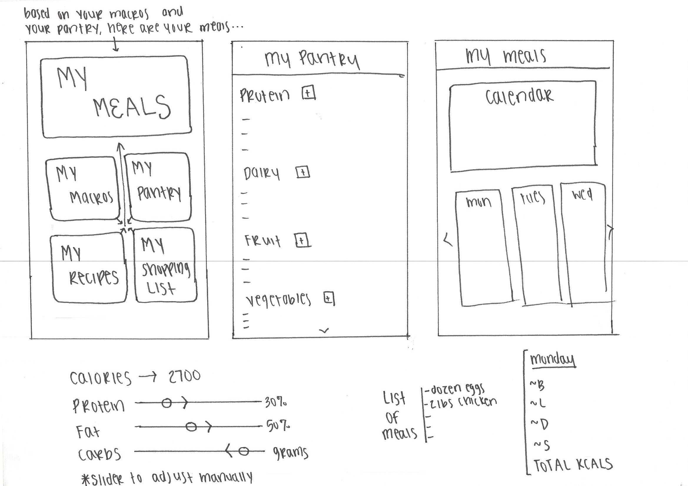
interactive calendar
I added a calendar so users would quickly be able to click a specific date and get their meals and information for that day. Because customization was extremely important, I also wanted users to be able to edit and filter things easily and efficiently.

Meals
When on the “My Meals” page you have access to all the meals you will be preparing that week. The app also provides goals for each day and personalizes it based not he individual. When a user clicks on the “Plus” the meal card will expand and give the user a more detailed view of their meals for the day, including a way to get to the recipe page and grocery list.
Data Visualization

Customizable visuals
When I created this page, I was pretending I was a first time user, so this is the “walk-through” of how to use this portion of the app. A lot of the reviews I read of the competing apps stated they liked the visual breakdown of data and that it made it easier to comprehend and digest. Not only did I implement that into Macrometer, but I also made it customizable. Each user can drag and change their macros and it will automatically adjust their meals accordingly. This was important for users who often need to change their intake to meet specific goals.
Desktop VS Mobile

Filters and personalization were important to users. In order for the app to utilize that feature, users needed to give specific information about their nutrition and workout habits, as well as their food preferences and any allergies they may have. Making my design responsive required thought into how I would visually layout all he components. I believe this page is the most visually different from all the others. I did not want users to have to continuously scroll on mobile in order to fill out the information, and I felt breaking it up into sections would make it easier for users to fill out.

Header Desktop VS Mobile
I changed the logo from desktop to mobile, which I felt fit well with the transition. I did usability testing and everyone preferred the bowl to be off to the side versus in the middle on mobile because it was too distracting on mobile.

Footer Desktop VS Mobile
Taking the footer from desktop to mobile was an easy transition, and a fun one. I thought it would be fun to play around with the bowl and had the food falling out and scattered all over the footer to give it a bit more of a visual appeal rather than just text.
Visual Design

While it looks like a lot of colors, the main reason is due to the bowl of food that I used. I had a lot of different colors in that bowl alone. I stuck mainly to a grey color palette and added pops of bold colors in here and there and played off the bowl of food.

I input my files into Zeplin for a developer. Click the button below for more information on the style guide and code for Macrometer.

Reflection
For only having 48 hours to work on this responsive design, I am extremely proud and happy with how it turned out. There are so many next steps I want to take in bringing this app to life and meeting all the user goals and needs. I would like to work with a developer on implementing a way for users to enter items they have in their pantry and refrigerator and have that sync with your phone. It would allow the app the ability to truly customize and tailor the meals to the items in your household, and it would provide a list of items you still need for specific recipes based on what you are missing from your pantry or fridge. Obviously this would require a lot more work than just the app alone. Essentially, you would need to somehow connect your fridge or have some type of setup so you could check off things quickly when you run out of an item.
Eventually, I would also like to translate this app into the gym. I know many gym-goers who get frustrated with having to enter in their reps and the weight they used when keeping track of their fitness activity. Again, this would require much more than just the app, but it is a fun thing to configure.
Overall, I really enjoyed this project. It was a great challenge, but I feel very pleased with the outcome. I was able to utilize my creativity and think outside the box, as well as really hone in on what users specifically want out of a very specific app.