vox photography
An authentic, genuine, and bold website creation
Client Timeframe
Vox Photography One week
Role
UX/UI designer
Responsibilities Members
Research Lauri
Ideation
Synthesis
Prototype
Wireframes
Personas
Usability Testing
Information Architecture
The company
Vox Photography is a small business owned by Shealee Ferguson. Her main focus is authenticity. She loves genuine connection in her shoots. Real smiles. Capturing the real moments between people and getting the true person or people, not just poses and then done. She never over touches so that her clients always look totally like themselves in the images. Shealee’s heart is to get images that they can cherish forever. No one regrets spending money on photography.
The problem
Vox Photography is currently only known through Instagram or word-of-mouth. Shealee is looking to grow her business and clientele through an intuitive, easy-to-use website that will help clients see her work, be aware of the pricing and packages she offers, as well as her mission statement, and an easy way to book photography sessions fast.
Process
The Project
Shealee has built a great photography business solely through Instagram, Facebook, and word-of-mouth. She is wanting to break into family and wedding photography more, which means she needs to have more than social media platforms to display her talent. Shealee needs a professional website that can showcase her beautiful photography, pricing, and options available to book a photography session with her.
Goals
The goal of this project was to create a simple, elegant, and user friendly photography website that would help Shealee gain traction and clients, further growing and strengthening her business. Customers wanted to know pricing for sessions and packages upfront, as well as an easy way to book through the website without having to go through the hassle of waiting to hear back from the photographer or an assistant. We live in a society of instant gratification, and many people want a hassle-free, easy, quick way to book sessions and know how much they are paying upfront.
The Mind of a photographer
Shealee with her husband and three kids
Shealee conveyed her need for a very authentic and genuine website. She feels that her pictures really capture who her clients are, and she wanted her website to have that same feel, only regarding herself and her work. On an aesthetic level, she wanted bright, fun, and simple. On a functional level, she wanted her customers to leave her website with very few questions. She wanted them to feel comfortable. As if they knew a little bit about who she was and what her work conveys.
In order to flesh out these details, I needed to know three major things:
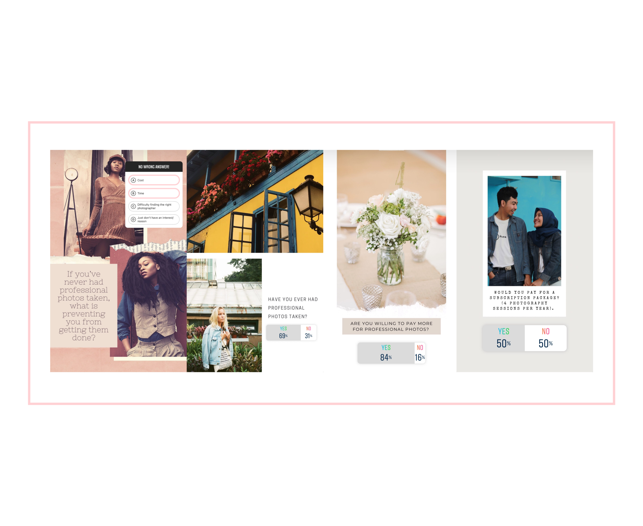
If people never had professional photos taken before, what was their reasoning?
Were they willing to pay more for quality pictures?
What was their biggest concern when looking into a photographer?
In order to find the answers, I created an 8 question Google survey that received 57 responses. I also posted a similar survey on Instagram and received great feedback.
Limitations
Cost was the biggest factor in why people never had professional photographs taken. Time was a close second. Many people wanted to pay a reasonable price for family photos or headshots and not break the bank. All of us lead very busy lives, and as a result, many of us don’t have the time or energy to find a photographer, set up the time, location, outfits, etc. Most people were willing to pay more for quality, professional photos if you take the stress and planning out of it.
Instagram Survey Results
I received similar answers to my Instagram polls as I did the Google survey. The average age of the responses from the Instagram polls ranged between 25-35. This generation uses social media for work, and many Instagram influencers are able to make money off the pictures they post and the content they are advertising. As a result, I had many people willing to pay for subscription packages because they do need high-quality photos taken for work much more frequently than most.
part 1: User personas
Once I had the bulk of my research finished, I felt comfortable creating my personas and narrowing my focus more.
Through the synthesis of my research, I realized that while I had very different clients, most clients shared very common goals and needs when it came to photography. As a result, I combined the pain points and goals I gathered from my research and created Olivia Smith and Kelly Delaware
Olivia Smith was a newly-wed who paid a lot of money for a photographer and videographer for the day of her wedding. One month after her wedding, she still had not received even a sample of the photographs taken. She reached out to the photographer multiple times and was told she would have the photographs soon. After two more months of waiting, she never heard back from the photographer. It has now been six months and Olivia has come to terms with the fact that she will not be receiving the photographs she paid for. She is looking for a photographer that she can rely on to recreate the images from her wedding day. She is also hoping for a discount since she already paid so much for her actual wedding day and did not receive any of the photographs. Olivia really needs a way to ensure the photographer she is working with is reliable and timely. She would prefer someone she can relate to and someone that is personable.
Kelly Delaware is a wife and mom to three children. She loves the memories of family photos and deeply appreciates photographers who understand her vision and what she is wanting out of a particular photoshoot. Cost is important to Kelly since she has three young children. Their family is extremely busy most days and runs from different activities and sports. Kelly wants to find a photographer that is willing to do most of the foot-work; setting up the location, outfits, scheduling, etc. Kelly would love someone that is great with kids and very personable and makes the photoshoot fun for her kids. Kelly is also looking for someone who would offer some type of package because she loves keeping her family photographs updated and cherishes watching her family grow through each picture she looks back on.
While both Olivia and Kelly have differing goals and pain points, they did have one major commonality: they wanted a relatable photographer who was reliable, patient, and made the experience fun. They wanted to feel that their visions are understood and that the photographer cares just as much about capturing their memories and stories.
This greatly helped confirm my user flows and pain points. I focused on the high points and tried to eliminate as much of the low points as possible while going through the ideation process and creating sketches.
Part 2: User Flows
Through the surveys and personas I was able to create the user flows. I wanted to showcase as much of the website as possible, so the flows went through almost every page of the website. It showed all of the goals and needs of the clients, as well as the photographer.
The Design Process
The Logo
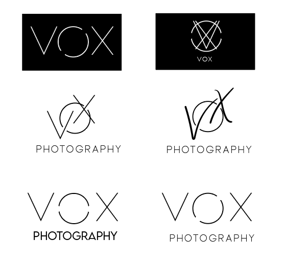
Shealee wanted a website that was easy to navigate, showcased her personality and her love for people, and bold, but also had flares of modernism and simplicity. I decided to start on her logo. I knew once I had that down I would be able to flesh out the rest of the designs. I mocked up a lot of different examples and then we narrowed it down. She wanted a simple and modern logo, so we decided to go with the top right…
To Extend or Not?
Shealee loved this logo and wanted to see it four different ways. She liked the extensions of the X and V, but could not decide which one she liked best. I mocked up four different versions and worked on a few more examples to share with her.
Logo Winner
I went with lighter lines and no extensions, which Shealee ended up adoring. She felt it was modern and displayed a unique way of combining shapes to create the name ‘Vox’. She said it was a unique concept she had not seen before.
Typography
Shealee wanted boldness and elegance, so we decided to go with two different main headers: bold and modern ‘Lemon Milk’ and a beautiful script, ‘Collection’, to bring in the femininity Shealee was after. Shealee was drawn to narrow, clean fonts, so for the main text we went with Roboto.
Color Palette
I sent Shealee a color palette website called Design Seeds that puts together beautiful color palettes and matches them with photos, so it is easy to see what it would look like overall. There were three particular palettes Shealee really loved, and we took different colors from all three and combined them to create this stunning palette.
Iconography
This was actually one of the very last things I did. I felt the website needed a little something more, so in Shealee’s ‘About’ section I created a resume timeline so clients could get a feel of where Shealee has been and how she got to where she is today. The timeline seemed too plain, and I knew icons were the perfect touch. I went with the dark icons versus colored for the website because unfortunately, they were too light to really pop the way we were hoping, but I figured I would include them because they were part of the process!
Standout Features
Below are features of the website that help cater to the user personas and the information gathered from the surveys. Clients get to feel more connected to Shealee by understanding what she values professional and personally. They also get to learn more about her and feel that they are cultivating a relationship with a friend versus just a photographer.
About Shealee
Nav Bar
FAQ
I wanted each person who came to Shealee’s website to have access to the most frequently asked questions, as well as the ability to ask their own question if it had not been answered in the FAQ. Transparency is very important to Shealee (and was a big need from the survey), and she never wants to mislead her clients, so this was a perfect way to create trust before even booking a session.
The end
I wanted the end of each page to give a call to action. I wanted the user to always have an easy way to book or reach out to Shealee. I also wanted the footer to be simple and not too complicated. Often times, users get lost in trying to find what they are looking for throughout extra links, text, and images at the very end of the website. I wanted Shealee’s to be straight-forward and simple.
reflection
This website creation was extremely fun and challenging. I loved the flexibility and laid-back nature Shealee approached this project with. She was so easy to work with and and we were able to get extremely creative and bold throughout this process. We are currently working with two developers to get these designs to actually function and come to life, so please check back soon for the link to her live website!


