
Elevance Health
“Delivering solutions beyond traditional health insurance”
Client Timeframe
Elevance Health (Anthem, Inc.) One week
Role
UX/UI designer
Responsibilities Members
Research Lauri
Ideation
Synthesis
Prototype
Wireframes
Personas
Usability Testing
Information Architecture
The company
Elevance Health, formerly known as Anthem, Inc., is an insurance company striving to improve the health of all. Their goal is to provide avenues to lifetime, trusted healthcare, and be a lifetime, trusted health partner. This is done through over 100,000 associates that serve more than 118 million people. With these associates they are able to address a wide range of needs while using a whole health approach. Their desire is to meet people at every stage of health.
The problem
Elevance Health is always working to provide the best experience for their customers and advocate for their needs. As such, listening to and acknowledging the users frustrations and critiques helps Elevance thrive and make changes accordingly. Elevance has an app for users called Sydney Health. It is through this app that users are able to get care, order prescriptions and refills, view their claims, and more. One of the more important aspects of health insurance is understanding how your benefits were applied for any care you received using an EOB, or Explanation of Benefits statement. We were tasked with figuring out a way to implement this in a way that was simple, effective, and useful, as users were struggling to not only find the EOBs, but understand what they were for and how they were used.
Process

The Project
Elevance Health has created a website and app that is constantly evolving with its users. Understanding how their benefits are being used, the services they are receiving, and making sure everything is aligned with what they have set up is one of the more important parts that needs to be seamless and efficient. We were tasked with making sure this section was easy to find, understand, and download/print if necessary.
Goals
The goal of this project was to create a simple, efficient, and user friendly way for users to navigate to the Explanation of Benefits Center, understand what their EOBs said, and how their benefits were being used. This not only applies to medical, but pharmacy, dental, and vision (if the user had those on their insurance).
Explanation of benefits

‘Explanation of Benefits Center’ main page
Through user research, we were able to gather three major needs for EOBs:
Users need to be able to navigate to EOBs from the claims page, as well as the navigation page. Users were looking in the navigation for EOBs, but were unable to find it. They also were going to claims, but it was towards the bottom of the page so it was not easily accessible.
Users need to understand what an EOB is and how to read it. Many users had no idea what an EOB was or how to figure out all the information once they would download their EOB.
Users needed to be able to filter their EOBs. Initially they could only go back one year, and could only filter by date. Many users states they would like to be able to filter back two years, and be able to search by member name and provider name.

Where can we find EOBs?
Through user research we found that claims was the page most people went to find EOBs. As such, we created space to allow for that functionality to exist. We placed it close to the top of the page so it was quick and easy to find.

what is an eob?
A lot of users were unfamiliar with what an EOB actually was, so we provided a way for them to access that via a drawer pop-up in the app. Right when they get to the EOB main page they are able to click a link that says, ‘Understand your EOB’ and get this pop-up filled with a ll the information they would need.

The Importance of Filters
Filter are extremely helpful when it comes to claims and EOBs. Many times there can be hundreds of appointments and visits to sift through. Originally, users could only filter by statement date and service date range, and the service date range only allowed going back one year, which was a pain point for users. If a user had multiple people on their plan, they wanted to be able to filter an individual member, as well as a specific provider. As such, we updated the service date range to up to two years, and added the ability for users to filter members and providers.
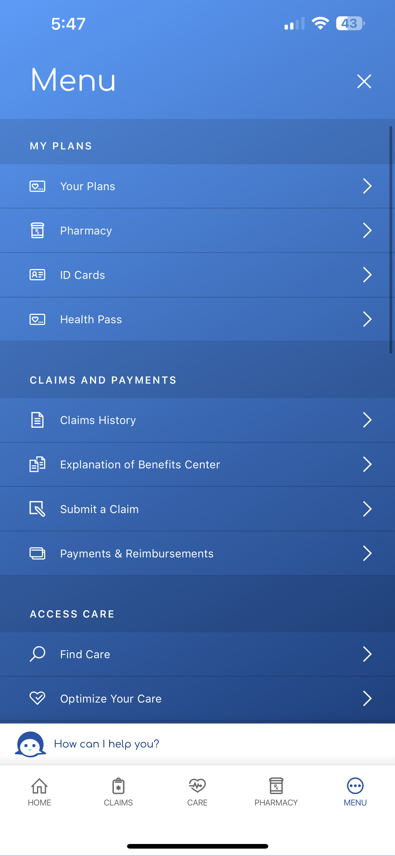
Main Nav Menu
Because we added EOBs to claims, we wanted the user to also be able to find it without having to go directly to the claims page, so we added it to the main navigation menu. This ensured users did not have to go to multiple pages to reach their EOBs and could quickly access it via the nav menu.

Explanation of benefits center main page
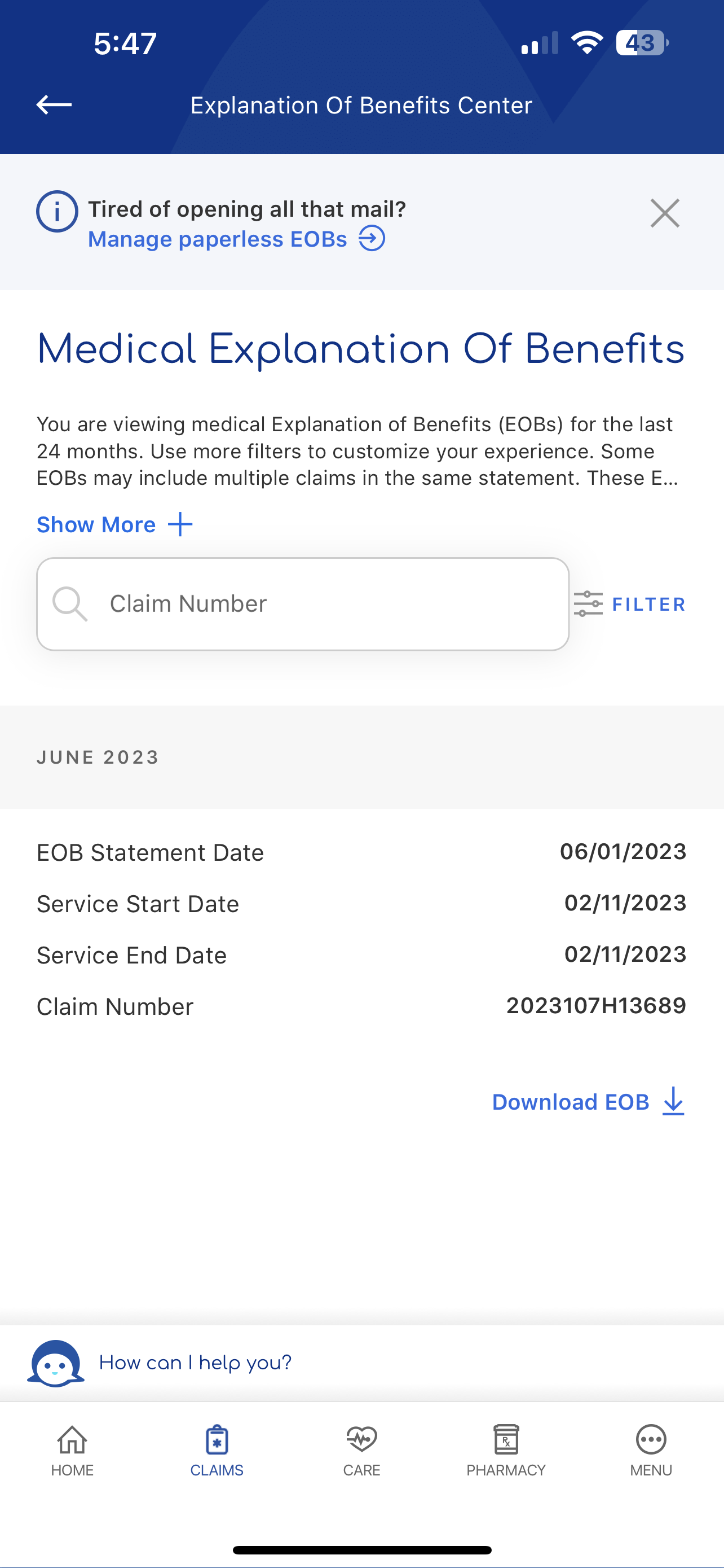
medical explanation of benefits
reflection
Working for a big company like Anthem means constant and continuous changes. Sometimes they are small, and other times they are much larger, but the purpose is always to ensure the user has an easy, seamless experience when navigating through their insurance website or app.